
Customizing
object properties
All objects
in Vivien have properties. Properties are the characteristics or attributes
that shape and define objects (for example, dimensions, color, and texture).
Properties that affect color, line weights,
shading attributes, are common to all drawn objects. Objects also have
properties that are particular to the type of object. When you select
an object and display its properties, a tab appears in the properties
dialog box for that type of object. When you select multiple objects of
different types, tabs appear for each type of object selected.
To edit object properties
- Select the object(s) that you want to edit.
- From the menu,
choose .
Result: The Properties window
opens.
Details about the options on the Properties window are described in the
following sections.
For information about Library object properties,
see “Library
object properties”.
General
object properties
In Vivien, there are three tabs that appear
in the properties dialog box for every object in your drawing. These three
tabs are the General, Appearance,
and Light Emission tabs.
For 3D solids and surfaces, the Solids and
Sidedness tabs also appear in the Properties window.
Objects also have properties that are particular
to the type of object selected. A tab appears on the Properties
window specific to that object. For details, see “Object-specific properties”.
General
tab
Options on the General tab
affect the selected object(s) color and line weights.
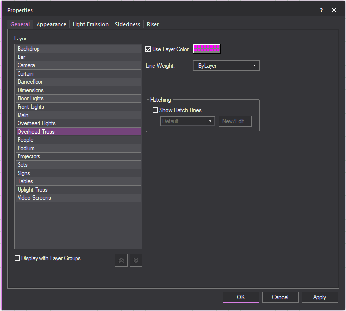
- Layer list: A list of the layers in your
document displays. Click a list item to change the layer the object(s)
will be drawn on.
- The layers are listed below the Layer Groups
if the Display
with Layer Groups checkbox is selected.
- Only the layers are listed if the Display
with Layer Groups checkbox is clear.
- Display with Layer Groups:
Select this checkbox to display the layers as items organized in Layer
Groups. Clear this checkbox to display only the list of layers.
- Collapse All button:
Click this button to display only the Layer Groups.
- Expand All
button: Click this button to display the Layer Groups and all
the Layers.
- Use Layer Color: Select this option to set the object(s)
color for drawing views to be the same as the properties of the layer
on which the object(s) resides. For more information on layer properties
and the coloring objects, see “Layer
properties” and “Rules for objects’ colors in Vivien”.
- Clear this checkbox and use the color button
to set a specific color for the object(s).
- Line Weight: From
the drop-down list, choose the specific line weight for the selected
object. The applied line weight is visible in all Wireframe views
in all modes. For objects only, you can also choose the default setting,
ByLayer, which sets the object’s line
weight to be the same as the properties of the layer on which the
object resides. The value Default means
that the document's line weight setting from the Document
Options > Object Settings window
is applied to the object or layer. For more information on layer properties,
refer to “Layer
properties”.
- Uncheck this option and enter a weight in the
box below to set a specific line weight for the object(s). The line
weight determines how thick the pen should be when printing a copy
of the document. The applied line weight is only visible in Print Preview and when printed.
- Not available for Library items.
Hatching
Customizable styles of how the wall is viewed in
wireframe view. These setting will not effect how walls are viewed in
virtual views.
- Show Hatch Lines:
Select this checkbox to display hatch lines on 3D solid objects and
surfaces. You can click the drop-down list to select the hatch style
or click the New/Edit box to create
new hatch styles or edit the hatch styles. Refer to “Hatching”.
Appearance tab
Use this tab to specify the appearance
of the different components that make up the currently selected item.
Based on the item that you have selected, the options in this tab differ.
You can use this tab to customize library
items by adding different materials, colors, and textures to each element
of the item. For example, the leaves and planter of the Potted Plant object
can have different colors applied to them.
You can also use this tab to rename the
individual elements of the currently selected object. This is useful for
objects that contain many elements with similar names, like risers.
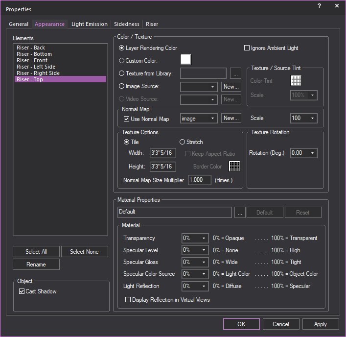
Note: You can apply textures to venues, surfaces,
risers, walls, library items, spheres, cylinders, and cones. You can apply
transparency to everything. When customizing the selected element, you
can choose between applying a custom color or a custom texture—you cannot
choose both. In addition to either color or texture, you can also apply
material.
Highlight the element that you want to
customize, and then choose one of the following options:
Color/Texture
- Ignore Ambient Light: The selected element(s) will always appear
using the color values derived from the Appearance options specified
(e.g., texture). While light emission and light from fixtures will
further saturate the colors displayed for the selected object, ambient
light will never affect this object if this option is enabled. This
option is useful when objects (except Screens) are textured with images
or video, and these need to appear in their original colors at all
times. In renderings, this setting is ignored if light emission is
enabled.
- Layer Rendering Color: Select this option to set the object(s)
color to the same as the properties of the layer on which the object
resides.
- Custom Color: Select
this option and then use the color button to set a specific color
for the object(s).
- Texture from Library:
Select this option to apply a texture from the library to the selected
object(s). In the resulting window, navigate to and select the desired
texture. You can apply textures to venues, surfaces, risers, walls,
library items, spheres, cylinders, and cones. Click the ellipsis button
(...) to change the selected texture file.
- Image Source: Select
this option to apply to the selected object(s) a texture that you
have created and saved in either .bmp, .jpg, .png, or .gif format.
To apply the image, you must create a new Image Source. To do so,
click New, and then use the Image
Manager to create a new Image Source with the image you created.
- Video Source: You
can apply a video source or a subsource as a “dynamic texture” to
Screen objects or Library objects with the screen element, such as
projection screens, TV screens, digital display screens, etc. Select
this option to apply a previously created video source or subsource,
or click New to create a new video
source or subsource directly from this window.
- Use Normal Map: Select
this checkbox to apply an Image Source that’s a Normal Map, to create
the perception of fragmented surface texture detail and depth, making
objects look more realistic.
Click this drop-down box to apply an existing
Normal Map image or click New to create
a new Normal Map image via the Image Manager.
Note: This drop-down lists all Image Sources that
appear in the Image Manager; as such, Image
Sources which are Normal Maps should be named appropriately, for easy
identification.
- Scale: Select the
height or depth of visual effect created by the Normal Map. Click
the drop-down box to select the percentage scale value from not visible
(0%) to maximum value stored in the imported Normal texture/image
(100%).
If you have chosen a texture option, then
you can also set the properties of the texture as follows:
- Tile: Select this
option if you want to have the texture repeated over the selected
element in a continuous series of squares or rectangles, and then
type the size of the frame in which you want the texture to appear
in the Width and Height boxes.
Based on the size that you enter, Vivien calculates how many times
the texture is repeated (or tiled) to completely cover the selected
element.
Note: When
tiling a texture on a sphere, cylinder, or cone, by default it will completely
wrap around the object. If you change the tile size, you will scale the
texture up or down accordingly. If you revert back to the original tile
values, you return to the default view.
- Stretch:
To have the texture stretch over the entire element surface,
click this option button. Based on the aspect ratio and the rotation
angle, Vivien evaluates the surface with all of its edges and stretches
the texture so the best fit is used. Note that this option is not
applicable when you apply textures to spheres, cylinders, or cones.
For these objects, Tile is the only
option.
- Keep Aspect Ratio:
Select this option to keep the aspect ratio of the original image
when it is stretched over the surface of the object you have selected.
This option helps avoid distortion of complex textures. If the texture
image cannot wrap completely over the entire surface of the object
while maintaining its original aspect ratio, then the color that you
choose in the Border Color box will
be applied evenly around any excess surface area not covered by the
texture (much like a picture frame around a picture).
- Border Color: If
you have chosen to preserve the texture’s aspect ratio, click this
box to choose the color that will be applied evenly around any excess
surface area not covered by the texture (much like a picture frame
around a picture).
- Normal Map Size Multiplier:
If you selected Use Normal Map, specify
the number of times the Normal Map is multiplied across the object
(element) to which it is applied. Type a value in the Normal
Map Size Multiplier box. (Enter a valid number between 0.01
and 100.)
Notes:
- The default value is 1 results in no changes
to the Normal Map’s size; values lower than 1 will increase the
size of the Normal visual effect, and values higher than 1 will
decrease it.
- The Normal Map Size
Multiplier operates within the Tile or
Stretch Texture Options.
- Texture / Source Tint:
This option will allow the color of an object’s texture to be altered
from the source color.
- Texture Rotation: If the texture has text or another
recognizable image in it, you might need to rotate the image to get
it right-side up. Select the rotation angle from this box.
Proceed with the following properties settings:
- Material Properties: Click the ellipsis button (...) to
choose a material for the selected elements. Click Default to
remove the selected material from the element and return to the default
material.
Material
When a material is selected, the properties
of the material will vary from one material to the next. The Material
Properties section enables these default material settings to be
changed. Each property value can be changed on a scale from 0%-100%. An
explanation of the value is found on the right side of the property.
- Transparency: This setting controls the proportion of
light that passes through the material. 0% being completely opaque,
100% being completely clear.
- Specular Level: This
setting controls how prominent other specular effects appear on the
material. 0% being no visibility of specular effects, 100% being a
maximum visibility of specular effects.
- Specular Gloss: This
setting controls the level of gloss a material will project. 0% will
project the gloss over a wide area, 100% will concentrate the gloss
in a small area.
- Specular Color Source:
This setting controls the color of light projected on a material.
0% will show only the color of the light, 100% will show only the
color of the material.
- Light Reflection:
This setting controls the amount of light that is reflected off the
material. 0% having no reflection, 100% being specular.
- Display Reflection in Virtual
Views: This setting controls whether true reflections are shown
by the object’s material in Virtual Views.
Cast Shadow
The Cast Shadow feature
gives you the option to cast shadows and display footprints of objects
in Virtual View.
- Cast Shadow: Select
this checkbox to display in Virtual View, the footprint/shadow of
the selected object. By default, Cast Shadow is
enabled for all objects; on the other hand, Cast
Shadow is disabled for all hang structures and fixtures
by default.
To rename object elements
You can use this procedure to rename object
elements that have similar names, giving them a more descriptive name.
For example, if you have customized a riser, you could give each side
of the riser a distinct name according to its custom properties. This
is especially useful for custom objects that you have drawn and are going
to save as custom library items. Since you cannot rename individual elements
of custom library items, it is best to do so before you save the item.
- Under Elements, highlight
the element that you want to rename. For example, highlight Riser
- Back.
- Click Rename.
- Type the new, descriptive name for the element.
- Click OK.
- Click OK in the Appearance tab to save your changes.
Light
Emission tab
Options on the Light
Emission tab affect the light emission properties for the
selected object(s). Light emission is defined as the ability for objects
to glow or emit light and can be used to simulate LEDs, lasers, neon,
light boxes, projection screens, glowing furniture, and so on.
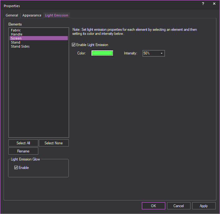
Highlight the element that you want to
customize, and then choose one of the following options:
Light Emission Glow
In this section, you can enable or disable
the Light Emission Glow feature per
object or per Element of an object.
Note: Glow must be enabled
in the Light Emission section of the
Visual Effects tab in the View
Options window to show the light emission glow effect from
objects in Virtual View.
- Enable: Select this
checkbox to display in Virtual View the light emission glow effect
from the selected Element of the selected object.
Clear this checkbox to disable the light
emission glow effect from the selected object. By default, Light
Emission Glow is enabled for all objects except Screens.
Tip: Screen objects have a separate glow option,
called Screen Glow, which is enabled globally
via the View Options > Simulation tab
in Virtual View.
Note: If
Light Emission Glow is enabled for a
selected Element of an object with multiple Elements (such as Risers,
Cylinders, etc.), only the selected Element will show the light emission
glow effect in Virtual View.
- Enable Light Emission:
Select this checkbox to enable light emission for the object, and
then choose the light emitting properties.
- Color: Click the
color box to choose the color of the light emission. Note that this
color overrides the object's original color, so it is best to choose
a similar, if not identical, color.
- Intensity: Select
the light-emitting intensity of the selected object. To adjust the
brightness of the object as it appears in renderings and Virtual Views,
choose a new intensity from this drop-down list.
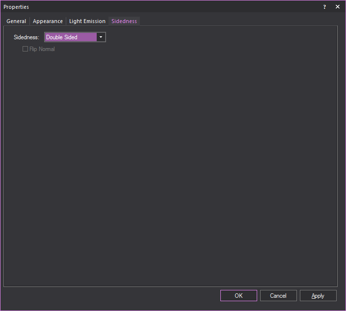
Sidedness
tab
Options on the Sidedness tab
affect how the selected object appears in Virtual Views and renderings.
Aside from the tents that come with the Vivien library, you cannot change
the sidedness of any of the objects that come with Vivien, either library
objects or default venues. By default, all objects in the Vivien library
except the tents are double-sided, which means that when you rotate them
in Virtual Views, all sides display equally and you cannot see through
them. Conversely, the default venues that come with Vivien are single
sided, which enables you to see “into” the venue when you rotate the image
in Virtual Views. (By default, the tents in the library are also single-sided,
which means you can see through them in the Virtual View. However, you
can change this feature by making the tent double-sided. For details,
see “To
change an object’s sidedness”.)
You can also change the sidedness of objects
that you have drawn in another program and imported into Vivien (i.e.,.dwg,
.dxf files or SketchUp files) or objects that you have drawn in Vivien,
such as custom venues, surfaces, or custom objects that you have added
to the library.
For these objects, you can use this tab
to change the sidedness from single to double sided, or vice versa. For
example, if you have drawn a venue as double sided, you can select it
and change it to single sided so that it behaves in the same manner as
the default Vivien venues (i.e., you can see into the venue as you rotate
it in Virtual Views). If you prefer to have an outside view of the custom
venue, then the double sided option is best as it prevents you from seeing
“through” the walls.
Note: You
can also use this feature to flip the faces of a custom surface from one
direction to the other if you do not like the way the object appears in
the Virtual View. For example, if the color or texture of the imported
object is facing inward when viewed on the Virtual
View tab, click to select the object on either of the drawing
tabs. Right-click and choose .
Click the Sidedness tab. Click Flip Normal, and then click OK.
To
change an object’s sidedness
You can use this procedure to change objects
from single to double sided and vice versa. You can also flip the faces
of a single-sided object so that they are oriented in the opposite direction,
either inward or outward.
Note: Aside from the tents that come with
the Vivien library, you cannot change the sidedness of any of the objects
that come with Vivien, either library objects or default venues. By default,
all other objects in the Vivien library are double-sided, which means
that when you rotate them in Virtual Views, all sides display equally
(they are not see through). Conversely, the default venues that come with
Vivien are single sided, which allows you to see “into” the venue when
you rotate them in Virtual Views.
- Select the object that you want to edit.
- Right-click on the object, and then select .
Tip: At any time, to access an object’s properties,
you can click the Object Properties tool
on the Modify toolbar.
Result: The Properties
window appears.
- Click the Sidedness
tab.
- Click the appropriate option button, either Double Sided or Single
Sided. To leave the single-sided object’s faces oriented in
the same direction in which they were drawn, proceed directly to step 6. To change the direction
of the faces, see step 5.
- If you are changing a double-sided object to single
sided, and you want to change the direction in which the object’s
faces are oriented (either outward or inward), select the Flip
Normal checkbox.
- Click OK.
- Review your changes in the Virtual
View tab and make adjustments as required.
- Double Sided: Select
this option to turn the single-sided object into a double-sided object.
Note that aside from the tents in the Vivien library, you cannot change
Vivien’s default venues from single to double sided.
- Single Sided: Select
this option to turn the double-sided object into a single-sided object.
For example, if you have created a custom surface/wall/venue and have
imported it as a double-sided object into Vivien, you can select it
and make it single sided so you can see “into” the venue when you
rotate it in Virtual Views.
Note: Aside from the tents in the Vivien library,
you cannot change any of Vivien’s other library objects from double to
single sided.
- Flip
Normal: If you have imported a custom-drawn object or drawn
an object in Vivien and you see in the Virtual View that it appears
incorrectly (the “faces” showing the texture/color are pointing inward),
select this checkbox to flip the faces in the opposite direction,
and then look at the object in the Virtual View again.
Object-specific
properties
Objects also have properties that are particular
to that type of object. For example, light fixtures have unit numbers,
but do not have a radius. When you select an object and display its properties,
a tab appears in the Properties window
box for that type of object. When you select multiple objects of different
types, tabs appear for each type of object selected. The following objects
are defined here:
- points
- lines
- cones
- spheres
- text labels
- dimensions
- library items
- light fixtures
- projectors
For venues, refer to “Defining
the venue”. For circles, arcs, walls, risers, cylinders, spheres,
screens and cameras, refer to “Drawing
objects”. In these cases the properties dialog offers the same
options that were given when the object was initially drawn.
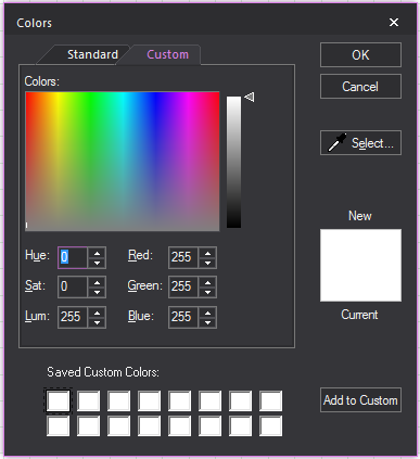
Colors
window
The Colors
window allows for full customization and control over colors used in Vivien.
From here the color of any object in Vivien can be changed. This section
will explain the various features of the color window.
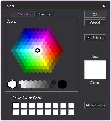
- Standard: A hexagon
of basic colors and shades available for selection.
- OK: Will confirm the
use of a new color to replace the current color.
- Cancel: Will exit
the color window without making a color selection.
- Select: This option
is used to gather a custom color sample from anywhere on your desktop.
This option will turn the cursor into a dropper from which colors
can be gathered.
- New: Color selected
in the Color window.
- Current: The color
that is currently in use.
- Saved Custom Colors:
A saved palette of custom colors.
- Add to Custom: Will
save selected New color to the Saved Custom Colors palette.
- Custom: Section for
editing a selected color’s properties.
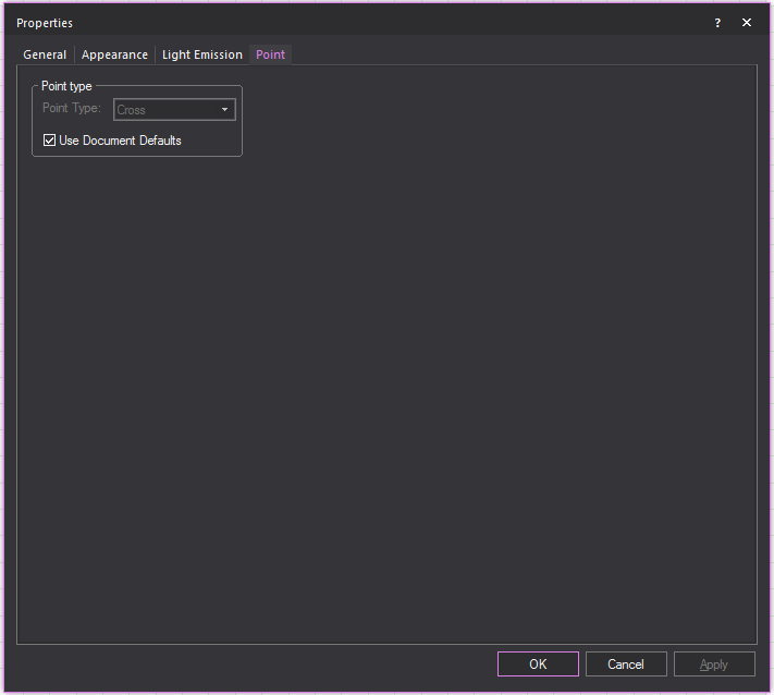
Point
tab
Options on the Point tab
affect how the selected points are drawn. The default point type used
in a document is defined on the Object Settings tab
of Document Options. To ignore the default
setting, clear Use Document Defaults and
select the desired point type.
Line
tab
Options on the Line tab
affect how the selected lines are drawn.
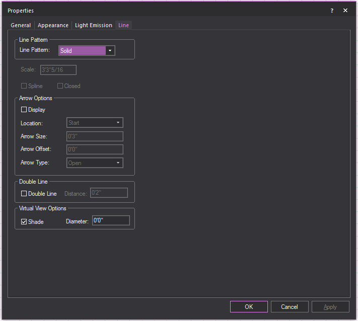
- Line Pattern: Choose
a line pattern for the selected line(s). “Drawing lines”
for an illustration of each type.
Note: Line patterns are available for a Rectangle,
Circle, Ellipse, Arc, and Elliptical Arc, in the corresponding Properties
window.
- Scale: Type a value
in the Scale box to change the length
and spacing of dots and dashes for the selected line(s). This is applicable
to center, hidden, or dot lines only.
- Closed: Select
this option to connect the first point of a multi-segment line to
the last point of that line.
- Spline: Select this
option to transform a line into a spline or french curve.
Note: You cannot change a line to a spline or french
curve unless the selected line has more than two vertices.
Arrow Options
How arrows attached to the line will be shown.
- Display: Select this
checkbox to show an arrow at the end(s) of the line.
- Location: Where the
arrow will appear on the line.
- Arrow Size: How large
the arrow will appear.
- Arrow Offset: How
far away the arrow if from the line.
- Arrow Type: The style
of arrow that will be displayed.
- Double Line: Select
this checkbox to display the line as a double line.
- Distance: How far
apart the double lines will be from each other.
Virtual View Options
Select the Shade option to have the selected lines displayed
in Virtual Views and renderings. Type a value for the radius to set its
weight.
Cone tab
Options on the Cone
tab affect how the object is drawn.
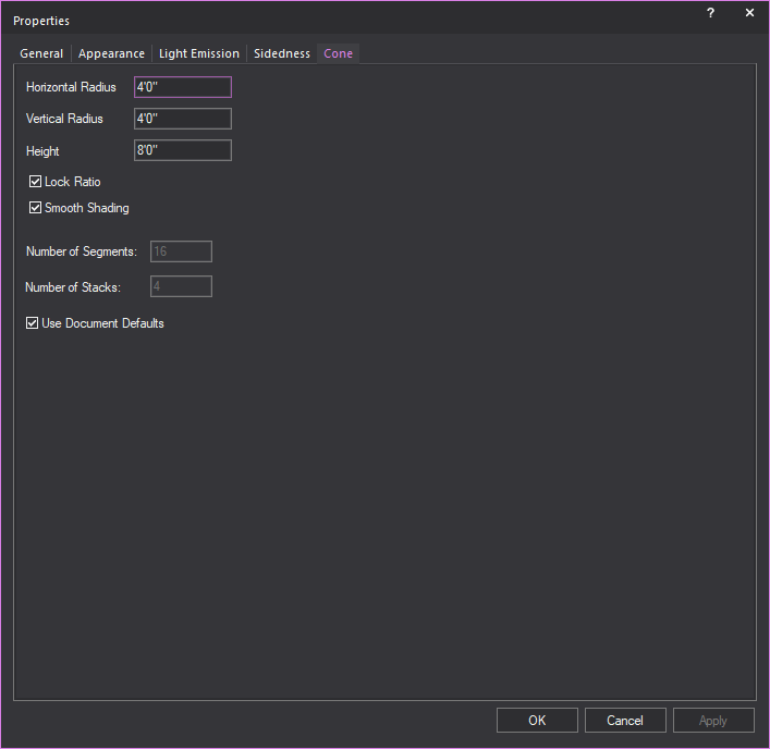
- Height: Type a value
to change the height of the cone.
- Horizontal Radius:
Type a value to change the width of the base surface.
- Vertical Radius: Type
a value to change the depth of the base surface.
- Lock Ratio: Select
this checkbox to lock the shape proportion when the size of the cone
is changed.
- Smooth Shading: Select
this checkbox to display a smooth appearance in Virtual View.
- Number of Segments:
Type a value to change the number of vertical divisions that appear
when the cone is broken into surfaces, or lines, or set pieces.
- Number of Stacks:
Type a value to change the number of horizontal divisions that appear
when the cone is broken into surfaces, or lines, or set pieces.
- Use Document Defaults:
Clear this checkbox if you want to specify the Number
of Segments and the Number of Stacks.
Sphere tab
Options on the Sphere
tab affect how the object is drawn.
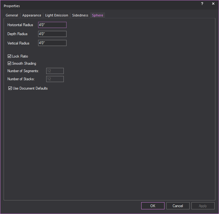
- Horizontal Radius:
Type a value to change the width of the middle of the sphere or equator.
- Depth Radius: Type
a value to change the horizontal depth of the middle of the sphere
or equator.
- Vertical Radius: Type
a value to change the vertical depth of the middle of the sphere or
equator.
- Lock Ratio: Select
this checkbox to lock the shape proportion when the size of the sphere
is changed.
- Smooth Shading: Select
this checkbox to display a smooth appearance in Virtual View.
- Number of Segments:
Type a value to change the number of vertical divisions that appear
when the sphere is broken into surfaces or set pieces.
- Number of Stacks:
Type a value to change the number of horizontal divisions that appear
when the sphere is broken into surfaces or set pieces.
- Use Document Defaults:
Clear this checkbox if you want to specify the Number
of Segments and the Number of Stacks.
Text label tab
Options on the Text
Label tab affect the justification and style of the selected
text labels.
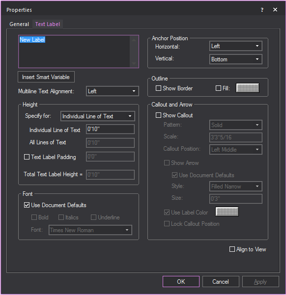
- Text Label: Type
new text to change the label.
- Use SHIFT+ENTER
to type on the next line.
- Use ENTER to
close the window (equivalent to the OK
button).
Tip: You can also type text labels with information
listed in the Event Info table using smart
variables %Variable Name% in
Text Label. The information will be displayed
automatically. For example, use %Director% and
the name of the Director stored in the table will appear in the Text Label.
- Insert Smart Variable:
Open the Smart Variables window and
select a smart variable text from the table of smart variables that
are listed in the Event Info tab
in Document Options.
- Multiline Text Alignment:
How the text in the Text field will be
aligned.
Height
Section for controlling the height of the text label.
- Specify for: Choose
how you would like to specify the height of the Text Label.
- Individual Line of Text:
Sets the height for a single line of text.
- All Lines of Text:
Sets the total height of all lines of text.
Example: If you set this to 4' and there are 4 lines
of text, then each line of text will be 1' in height.
- Text Label Padding:
Adds space between the text and the text label border.
- Total Text Label Height:
The height of the text and text label padding combined.
Font
Section for controlling the font settings of the
text label.
- Use Document Defaults:
Clear this checkbox to choose the default font and font styles for
all text labels, and then make your selections.
Anchor Position
Section for controlling how the text label
is anchored.
- Horizontal: Select the Text label’s horizontal
alignment from the drop-down menu. The available horizontal alignment
options are:
- Left: Places
the selected text label to the left of the insertion point.
- Center:
Horizontally centers the selected text label on the insertion
point.
- Right: Places
the selected text label to the right of the insertion point.
- Vertical:
Select the text label’s vertical alignment from the drop-down
menu. The available vertical alignment options are:
- Top: Places the
selected text label below the insertion point.
- Center: Vertically
centers the selected text label on the insertion point.
- Bottom: Places
the selected text label above the insertion point.
Callout and Arrow
Section for controlling how callout lines
and arrows attached to the line will be shown.
- Show Callout: Select
this checkbox to display the text label with a callout line.
- Pattern: The pattern
of the callout line.
- Scale: The dimension
at which the callout pattern is to be viewed at making it legible.
- Callout Position:
The position on the text label where the callout will extend.
- Show Arrow: Select
this checkbox to show an arrow at the end of the callout.
- Style: The style
of the callout arrow that will be displayed.
- Size: How large of
the callout arrow that will appear.
- Use Label Color:
When selected will use the same color as the text label for the callout.
If not selected a different color can be chosen.
- Lock Callout Position:
When selected will lock the position of the callout when the text
label is moved.
- Align to View: Select
this checkbox to set the text labels to be legible regardless of plot
type.
Dimension
tab
Options on the Dimension tab
affect the appearance and measurement mode of the selected dimension(s).
To change the length of a dimension, it must be stretched in the drawing.
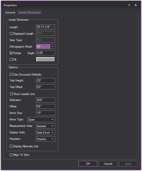
Linear Dimension
View and change how the linear dimension
is displayed.
- Length: This box
is not editable. It displays the actual length of the line drawn for
the dimension.
- Displayed Length:
Select the checkbox and type a value you wish to display.
- View Type: This box
is not editable. It displays the plot type in which the dimension
label is visible, which is determined when the dimension is drawn.
- Orthographic Mode:
Select the view in which the dimension will be visible.
- Rotate: Select the
checkbox to rotate the linear dimension.
- Angle: Type the angle
of rotation.
- Fill: Select the
checkbox and click the color select box to change the fill color behind
the dimension text.
Options
Customize the other elements of the linear
dimension.
- Use Document Defaults:
Toggle this option to specify whether the dimension is to use default
document settings as configured in the Dimension tab,
or use custom settings.
- Text Height: The
height of the text used in the dimension.
- Text Offset: The
positive or negative offset of the text.
- Show Leader Line:
Select this checkbox to display the leader line that connects the
text to the linear dimension.
- Extension: The length
of the extension lines.
- Offset: The distance
from extension line from the object being measured.
- Arrow Size: The size
of the arrow head used on the dimension.
- Arrow Type: The style
of arrow head used on the dimension.
- Measurement Units:
Measurement modes are explained in “Drawing
dimensions”. Select Imperial or
Metric to
change the measurement units.
- Display Units: The
preferred way to display measurements. For Imperial measurements,
choose between Feet & Inches, or just Inches; For Metric, the
options are Meters, Centimeters or Millimeters.
- Precision: Specify the measurement precision
of the dimension line. Based on your choice for measurement units,
you can choose to display the drawing resolution in centimeters, millimeters,
whole numbers, or fractions.
- Display Alternate Unit:
Select this checkbox to display the alternate unit.
- Align To View: The
orientation of the text used in the dimension. Select the checkbox
to set the horizontal alignment of the text to match your view.
Wall tab
Once a wall is created its properties can
be edited in the Wall tab. This is accessible
by selecting the wall and choosing > > Wall.
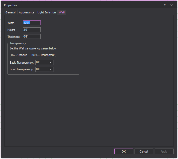
- Width: Current width
of the wall.
- Height: Current height
of the wall.
- Thickness: Current
thickness of the wall.
Transparency
A measure of how solid the wall appears
to be. 0% being opaque, 100% being transparent.
- Back Transparency:
Transparency setting for the back of the wall.
- Front Transparency:
Transparency setting for the front of the wall.
Library
object properties
To view library object properties
- Open the Library Browser.
- Navigate to the desired object.
- Select the object and then click the Properties tool
at the top of the Library Browser.
 The
Properties button.
The
Properties button.
or
Hold the ALT
key and double-click the object name.
Result: The Properties
window for the selected object opens.
Two tabs appear in the properties dialog
box for every object in the library: Appearance and
Characteristics. Light fixtures also have
Options and Projection
tabs.
Tips:
- You can open properties dialog boxes for multiple
objects at one time. You might want to do this to compare data, such
as weight information.
- To view library object properties without opening
individual property boxes, browse the library using the shortcut bar.
To do this, select the shortcut bar for the type of object you want
to view. Right-click in the shortcut bar and choose (for example, ).
The Library Selection dialog box
opens with a properties pane included.
- You can modify some object properties create
the look you want. You can also associate costing information with
each object. For details, “Customizing
object properties”.
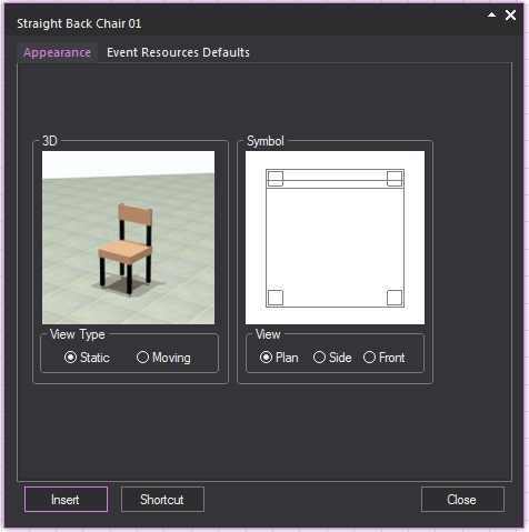
Appearance
tab
The Appearance tab
displays a Virtual View and an image of the symbol for the library item.
- View Type: Indicates
whether the Virtual View of the object is fixed (static) or animated
(moving).
- View: Click Plan, Side, or Front to view the object symbol in the
different views. The Wireframe view changes depending on the view
type that you select.
Event
Resources Defaults
Options on the Event
Resources Defaults tab are read-only and are set when the
object is added to the library.
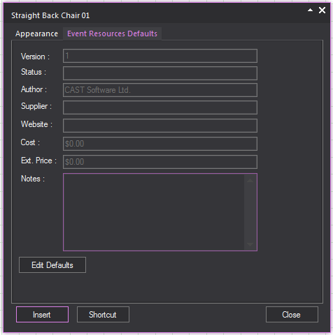
- Version: Release number
of the library object.
- Status: Status of
the library object. Beta indicates
that the object is completed but not verified. Release indicates that it has been tested and is
accurate. A status of Preliminary indicates
that the object has minimal functionality.
- Author: The individual
or company that constructed the library object.
- Supplier: The company
or individual that provides the library object
- Website: The relevant
website of the library object.
- Cost: The cost of
the library object.
- Ext. Price: The extended price, or markup
placed on the library object.
- Notes: Any notes that
pertain to the library object. The notes usually pertain to the simulation
capabilities in Vivien.
- Edit Defaults: A menu
for editing the selected library item’s Supplier,
Website, Cost and
Ext. Price characteristics.
For more information on how to manage the
properties of event resources, “Managing/Editing resource properties”.
Projector properties
After you use the Projection Wizard to
draw a projector on its own or a projector/screen combination, you can
use the Properties dialog to change
the settings of the projector and screen. If you double-click a projector/screen
combination, the following tabs appear:
- Projector
- Drape Kit (only if you have drawn a folding screen)
- Screen Frame
- Screen
While most of the boxes on the Properties
tabs are the same as those that appear while you create the projector/screen,
a couple of boxes are unique to these tabs, meaning that you can specify
certain types of properties only through
the Properties tabs, as shown in the procedures that follow.
To
hide the projection rays in wireframe view
By default, when you draw a projector,
the projection rays are shown in Wireframe views. However, you can use
the Projector properties tab to hide them.
- In the Drawing Wireframe or Drawing Quad tab,
click to select the projector, and then right-click and select .
- Click the Projector
tab.
- Clear the Show Projection
Rays in Wireframe checkbox.
- Click OK.
To specify the diameter of the screen’s support frame/tripod
By default, when you draw a projector and
screen (or a screen on its own), the diameter of the supporting frame
is set to one inch. However, you can change the diameter to any value
you like, as shown below.
- In the Drawing Wireframe or Drawing Quad tab,
click to select the projector/screen (or just the screen), and then
right-click and select .
- Click the Screen Frame
tab.
- In the Support Diameter box,
type the new diameter of the screen’s support frame or tripod.
- Click OK.
 © The CAST Group of Companies
Inc., 2004-2022 All rights reserved.
© The CAST Group of Companies
Inc., 2004-2022 All rights reserved.