
When you create or open an event document, the Vivien event window displays. This section describes the event window and all its components.
In this section
Working in the Virtual View tab
Virtual view fixture selection
Exporting images from Virtual View
The following graphic shows the Vivien Virtual Event Designer event window.
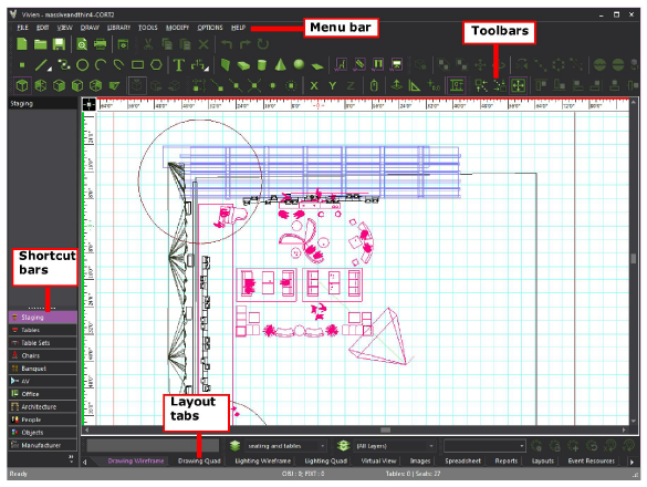
The menu bar is located at the top of the Vivien event window, above the work area. The available menus change depending on the tab selected at the bottom of the work area. The menu bar is dockable, which means you can move it to another area on your screen.
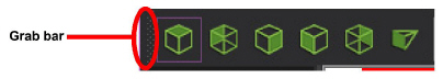
By dragging the grab bar to the left of the menu, you can place the menu bar on the edges of the work area (top, bottom, left or right).
You can also drag it off the edge of the work area and into its own window. This window remains on top of the Vivien screen and can be dragged anywhere on your display.
You can access menu commands using a mouse, keyboard, or using hot keys. For more information, see "Hotkeys".
Result: The menu displays.
Some commands have shortcuts that do not require menu selection. In those cases, the shortcut keys are listed to the right of the command in the menu.
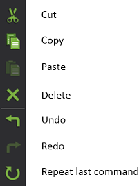
Example: To undo the last command, press CTRL+Z.
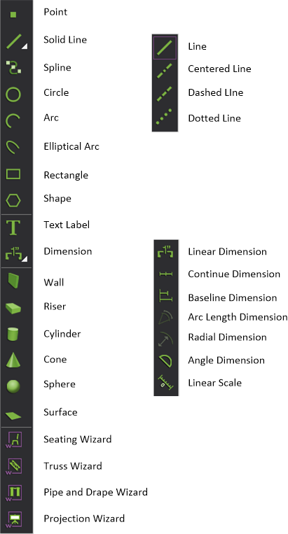
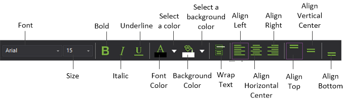
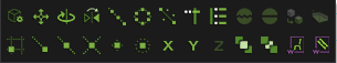
Toolbars provide button access to most commands. This is in lieu of selecting the commands through the menus in the menu bar.
Like menus, the available toolbars change depending on the tab selected at the bottom of the work area. However, unlike menus, you can customize how the toolbars are arranged and which toolbars display.
Toolbars are typically found directly under the menu bar. You can move toolbars around the screen by dragging the grab bar to the left of the menu.
You can place them on the edges of the work area (top, bottom, left or right). You can also drag them off the edge of the work area and into their own windows. These windows remain on top of the Vivien screen and can be dragged anywhere on your display.
The following toolbars are available (listed in alphabetical order).
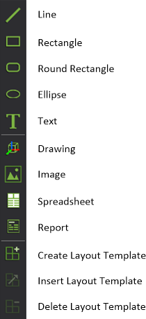
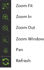

Result: A list of toolbars displays.
Note: Toolbars that are grayed in the toolbar selection list are not used in the selected tab.
Alternatively, right-click in the toolbar area and from the toolbar list, select Toolbars.
Result: The Application Options window opens.
Toolbars that are grayed in the toolbar selection list are not used in the selected view tab.
For more information on the Toolbars tab, refer to "Toolbars tab".
Floating Toolbars are available in Vivien to offer common features conveniently at your cursor. When you right-click on a view, in addition to the usual right-click menu, a floating toolbar will appear either above or below the right-click menu (depending on where you clicked on the screen).
The icons displayed are the same as the ones displayed in the menus and toolbars. If you are not familiar with an icon, hover over it and a tooltip will appear displaying the feature's name.
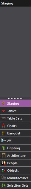
Shortcuts provide quick access to library items and views. The shortcut bars located on the left side of your screen display and organize shortcuts. Click a shortcut bar to display the shortcuts for that shortcut type (for example, click the Chairs shortcut bar to display all the chair shortcuts).
In the Shortcut Bar, a separator can be inserted between the shortcut icons or a group of shortcut icons. The shortcut bar separator helps you group, segregate and organize the various shortcut icons accordingly.
Shortcut separators can be inserted from the Manage Navigation Shortcuts window or you can right-click on the space within the shortcut bar and choose the Add Separator menu.
The available shortcut bars change depending on the selected view tab.
There are two types of shortcuts:
Add frequently used library items to the shortcut bar to make access more immediate than browsing the library for the items. You can create library item shortcuts under the following shortcut bars:
 Architecture
 A/V
A/V Objects
 Lighting
 People
 Chairs
 Tables
 Table Sets
 Banquet
 Staging
 Manufacturer
 Selection Sets
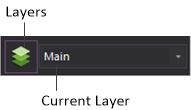
You can save multiple versions of some Vivien views and quickly open them from the shortcut bars. For example, in the Spreadsheets tab, the default spreadsheet is named Title Block and has a shortcut under the Spreadsheets shortcut bar. You could create a different version of the spreadsheet by creating a shortcut for it and then making your changes to the spreadsheet. Any changes you make to the spreadsheet while the shortcut is selected are saved automatically and associated with that shortcut. You can quickly switch between the two versions of the spreadsheet by clicking their shortcut icons.
You can create shortcuts for the following views:
|
Resources (Event Resources tab). See "Creating a new event resources spreadsheet". |
|
Spreadsheet (Spreadsheets tab). See "Importing information into spreadsheets". |
|
Images (Images tab). See "Importing images". |
|
Layouts (Layouts tab). See "Creating new layouts". |
|
Looks (Lighting Wireframe, Lighting Quad and Virtual view tabs). See "Saving lighting Looks". |
|
Render (Lighting Wireframe, Lighting Quad and Virtual view tabs). See "Background Rendering Manager". |
|
Virtual View Profiles. See "Virtual View Profile". |
The procedure for creating, modifying, and working with shortcuts is the same regardless of the type of shortcut.
Result: For Library shortcuts you are prompted to select the object. For View shortcuts, you are prompted to type a name for the new shortcut.
Result: The shortcut is created and added to the bottom of the list on the shortcut bar selected in step 1.
Result: You are prompted to confirm the deletion.
Result: The selected shortcut is deleted.
Result: The selected shortcut is renamed.
Result: The selected shortcut is cloned and the copy is added to the bottom of the list.
Result: Choosing Icons displays all shortcuts as icons. List causes the shortcuts to be listed in the shortcut bar area, thereby allowing you to fit more shortcuts in the area.
The settings are applied to all shortcuts.
Note: To scroll to the bottom of a long list of shortcuts, use either the scroll button on your mouse or the scroll bar along the side of the shortcut bar.
Result: The Shortcut Property dialog box appears. These settings affect the object or view of the selected shortcut.
Note: Event Resources and Layouts shortcuts open the View Options dialog box. See "Customizing the inventory" and "Modifying layout settings".
For library objects, the name of the object as listed in the library, displays in the Type box.
You can configure the shortcut bar to show fewer/more categories, and reorder the categories that you see.
Result: The Manage (shortcut type) Shortcuts dialog box appears.
Result: On the shortcut bar, a shortcut separator appears on the space below the selected shortcut.
Tip: On the shortcut bar, you can also right-click on the space where you want to insert a separator and click the Add Separator menu.
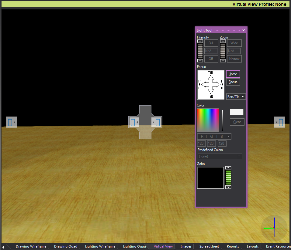
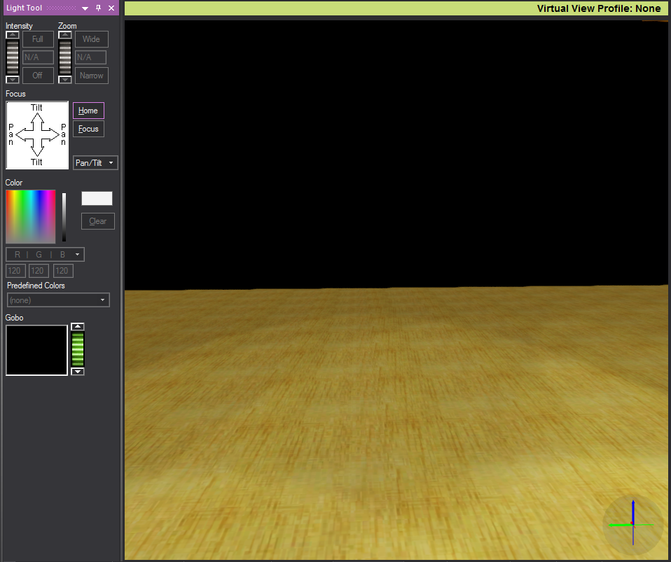
Most tools in Vivien when selected create a separate window where all the options of the feature are available. How these windows appear and are accessed in Vivien can be customized to suit your individual work style. If a Vivien document is saved, Vivien will remember your window preferences for the next time the document is opened.
Window position options can be accessed by clicking the down arrow at the top of the window, and opening the Window Position drop-down menu.
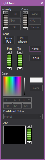
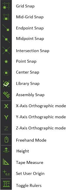
The Ruler Tool helps you plot your events in the drawing views by providing a visual aid for coordinate reference and measurement. By default, the Ruler is aligned with the document origin and displays coordinate information along the top and left side of the view. Its scale matches the default grid scale.
As shown in the graphic below, the Ruler has different colors to represent different axes (X=Red, Y=Green, Z=Blue).
The Ruler dynamically updates its resolution based on the zoom ratio that you select. As you zoom in on your drawing, the precision of the ruler is increased, displaying fractions and decimals; when you zoom out, the precision is decreased to the point where both the grid and ruler disappear. The ruler matches the unit type currently set in your file, either Metric or Imperial.
The Ruler displays values with the negative sign to the left of 0’0” when in Plan, Front and Right view, or to the right of 0’0” when in Back and Left view.
On the Drawing Quad tab (as shown above), each of the three drawing quadrants can have a different drawing origin. If desired, you can move the zero position of the ruler (-0 0+) to correspond to this point.
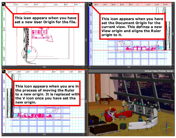
Based on the origin in the active quadrant and the corresponding position of the Ruler, the icon in the upper left corner of the Ruler changes.
Icon |
Description |
|---|---|
|
The Ruler’s zero position (origin) is aligned with the Document Origin, which is set by default to be the center point of the Vivien venue defined for the event. |
|
By default, all views are set to the Document Origin. However, you can set the origin for each view, thereby defining a View Origin. This icon appears when you have defined a View Origin for the current view and have aligned the Ruler’s origin to it. |
|
This icon appears when you have set a new User Origin for the file by clicking Tools > Set User Origin. |
|
This icon appears when you have clicked Move Ruler (Set View Origin) from the Ruler menu and are in the process of defining your new origin. |
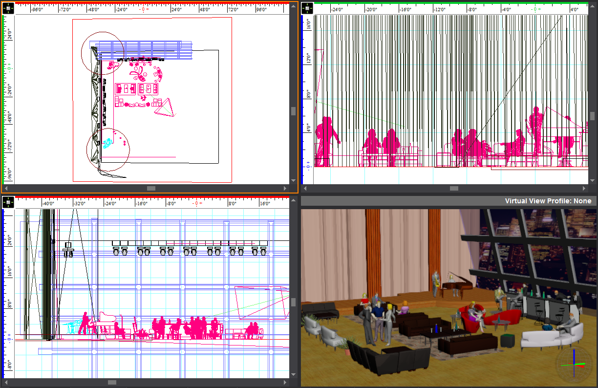
The following graphic shows a Drawing Quad tab in which the Ruler origin is different in each view:
By default, the ruler is aligned with the document origin, which means that the zero mark (-0 0+) starts at the Document Origin. However, you can move the Ruler from this default position to the origin of the current view. Note that doing so does not affect the origin or ruler of any other view.
By default, the Ruler is turned on when you open a new Vivien file. You can turn the ruler on and off while working in your file by using the Ruler Toggle icon.
 The Ruler Toggle button.
Result: The Ruler appears or disappears.
Note: You can also toggle the ruler on or off by using the Draw Defaults tab in Document Options.
The work area changes depending on the selected view tab.
View tabs display at the bottom of the work area. These tabs define work areas that are designed for specific tasks. For example, the Drawing Wireframe tab displays a CAD-like work area for drawing your event plan. The Event Resources tab includes a split work area that lets you work with your objects in the drawing and manipulate object information in tabular format. You cannot edit tabs or save custom tabs, however you can display them in separate popup frames.
When you first create a new event document, Vivien defaults to the Drawing Wireframe tab.
Click any of the tabs to change the work area.
Use the Drawing Wireframe tab to create the event drawing.
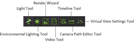
In Vivien Virtual Event Designer, you can view the drawing from different perspectives. You can view the drawing in two dimensions (flat), from the top (plan), left or right, and you can view the drawing in three dimensions (3D). The work area has a grid to help you place objects.
The Drawing Quad tab has four views of the event drawing to help you work with and visualize your plan. It includes three wireframe views (by default, a plan view, a front view, and a right view), and a 3D Virtual view that simulates the way the view would look in real life without any custom lighting. In the Virtual View, surfaces are “filled in” or solid (shaded) rather than outlined as in drawing wireframe views. You can move the camera in this view, but you cannot add or manipulate objects in it.
Use the Lighting Wireframe tab to customize different lighting effects. You add light fixtures in the Drawing Wireframe tab, but any modification to the lighting must be done in the Lighting Wireframe tab where you can isolate the lighting and immediately view the effects.
Similar to the Drawing Quad, the Lighting Quad tab has four views of the drawing. It includes three wireframe views and a 3D Virtual View.
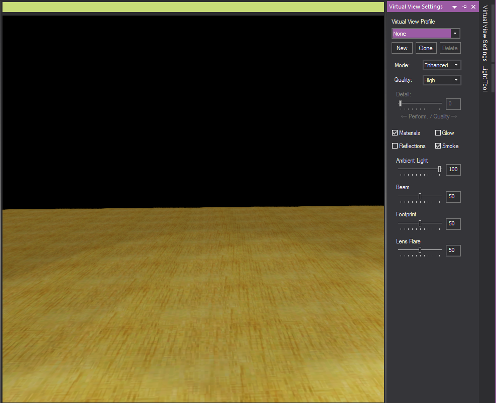
The Virtual View tab displays a realistic (rendered) view of the drawing in 3D that simulates the way the event would look in real life with the custom lighting you may have added. Surfaces, are “filled-in” or solid (shaded) rather than outlined as in drawing wireframe views. For information on arranging the image in this tab and exporting images from it, see "Working in the Virtual View tab".
The Images tab provides an area to store images like renderings and logos. Renderings are stored here automatically when you use the default render options. You can export images from this tab and save them as a graphic file on your computer, to be used in proposals, sent to your clients by email, etc. You can import any other images in many graphics formats (for example, bitmap, .jpeg, .gif, .tiff, .png, .tga, and so on).
Use the Spreadsheet tab to create spreadsheets containing information unrelated to the event resources, but relevant to the event (for example, budgets, schedules, human resource requirements). You can add these spreadsheets to your printable layouts for the event.
The Reports tab enables you to open a series of pre-formatted reports that are generated by Vivien, containing all guest information and table seating assignments, plus some catering lists for your event. These reports are available for you in three pre-defined template styles. Reports are designed to be printed documents.
The Layouts tab provides all the tools necessary for creating professional printouts of your event document. You can include drawings, spreadsheets and images in your layouts.
The Event Resources tab allows you to work with your information in a wireframe drawing view and manipulate it in tabular format. The event resources provide an inventory of all the items in the drawing that were added from the Library. Changes to the event resources view are reflected in the drawing view and vice versa. You can export the event resources to an external spreadsheet program where you can format and manipulate the information.
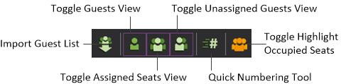
The Guest Management tab enables you to: seat your guests at tables and chairs; track which guests have been seated and which have not yet been seated; number banquet tables using the numbering tool; and label chairs and tables using a variety of options.
You can create your own custom tab layouts, and specify your workspace as you wish. This feature allows you to customize your workspace with any combination of layout windows, and then saves these setting in a layout tab.
The Views that can be displayed in a Custom tab include:
Custom tabs are stored with the application. Once created, a Custom tab will always be available on the computer (until it is deleted).
Note: You can currently create up to 5 custom tabs in your installation.
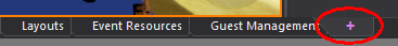
Note: You can also click the + tab by the layout tabs.
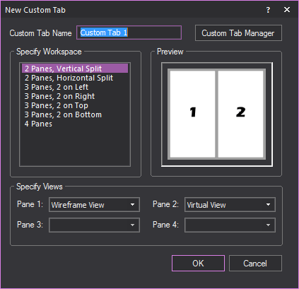
Note: A preview of how the tab will look will appear in the Preview section.
Note: Refer to the Preview section for the location of the pane in the custom tab.
Result: The custom tab will be created. The custom tab will appear with the default tabs at the bottom of the layout.
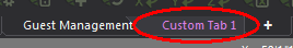
Note: You can also right-click the custom tab and select Rename.
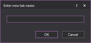
Result: The custom tab will be renamed to the new name.
You can copy any existing tab in wireframe mode. This will create an exact duplicate of the original tab. You can then use or edit both tabs as needed.
Note: You can also right-click the tab and select Duplicate.
Result: The selected tab will be copied and appear with the other tab.
You can hide tab that you do not want to see in wireframe mode. This is useful if you have a number of custom tabs and want to reduce clutter.
Note: You can also right-click the tab and select Hide.
Note: To unhide all hidden tabs, select Open all Hidden Tab.
Tip: You can also right-click the tab and select Unhide > [Hidden tab name].
Result: The selected hidden tab will be visible again.
Result: A dialog box will appear asking if you really want to delete the tab.
Result: The tab will be permanently deleted.
You can change the order which tabs are ordered.
The Custom Tab Manager is a feature to help you keep track and manage any custom tabs you create.
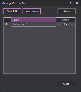
From the View menu, select Custom Tab > Custom Tab Manager.
Result: The Manage Custom Tabs window appears.
 © The CAST Group of Companies
Inc., 2004-2022 All rights reserved.
© The CAST Group of Companies
Inc., 2004-2022 All rights reserved.


